Ah, so, I liked this design, but this site kind of dissolved into the ether after a few months. I still sort of like it. The central logo is neat, and I enjoy the layout, with the exception of that godawful gradient. T’was ahead of its time design-wise, although now it is just kind of with its time… sorta.
Heh heh, I love how that banner image looks on the blog here, white is just the best background color…
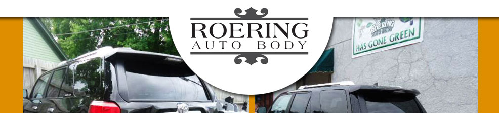
I did their logo for them as well, which turned out pretty good. It used elements from their shop that they enjoeyed, and also just sort of decomposed over a number of months due to lack of contact. Lessons were learned! Someday maybe this project will rear its head and need to be battled once more, but that would likely require me to actually be assertive. So we’ll see.